Color sets the mood of every room. Whether you’re styling a modern loft in SoHo or a prewar apartment on the Upper West Side, the way paint and fabric interact can define how your space feels: calm and airy, warm and grounded, or bold and expressive.

Great design starts with harmony. Matching your paint tones to your window fabrics is not about choosing identical colors. It’s about creating balance, depth, and visual flow throughout your home.
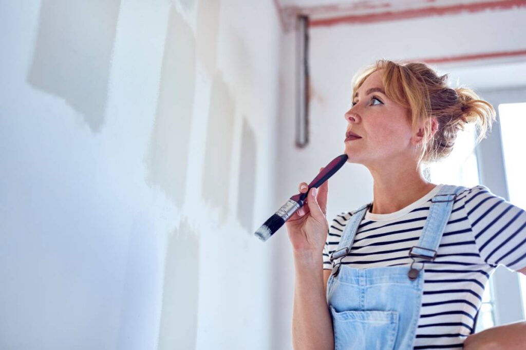
Start with the Undertone
When choosing a wall color, every shade has an undertone that makes a neutral appear warm or cool. Understanding that undertone helps you find window fabrics that complement rather than clash.
For example, walls painted in neutral paint tones such as soft gray or greige pair beautifully with drapery fabrics in cooler whites, linen blends, or silvery textiles. Warm cream (like Cream 2159-60) or beige walls (like Shaker Beige HC-45) work best with fabrics that carry similar golden or taupe undertones.
This attention to undertone keeps your design cohesive and adds a quiet sophistication that feels intentional.
The Allure of Earth Tones
Natural hues continue to define timeless New York interiors. Think earth tone paint colors such as clay, terracotta, olive, and sand paired with natural fibers like linen, cotton, and woven shades. These palettes create warmth without heaviness and bring a fresh, grounded feeling to the space.
Layering organic materials enhances the connection between your paint and fabrics. A clay-colored accent wall might echo in drapery with rust or umber threads. A moss-green paint tone finds harmony in textured fabrics with subtle sage or ecru undertones.
The result is a home that feels curated and lived-in, inspired by the natural landscape but styled for city living.
Elevating a Two-Tone Palette
If you enjoy contrast, two tone paint is a refined way to highlight architectural details and make your windows a design focal point. A deeper hue below a chair rail with a lighter shade above creates dimension and allows your window fabrics to act as a bridge between the two.
For example, if you have navy below and white above, a patterned Roman shade, like Vignette® Modern Roman Shades, or drapery that includes both colors ties the scheme together. This layered approach makes a room feel designed from every angle, not just painted and furnished.
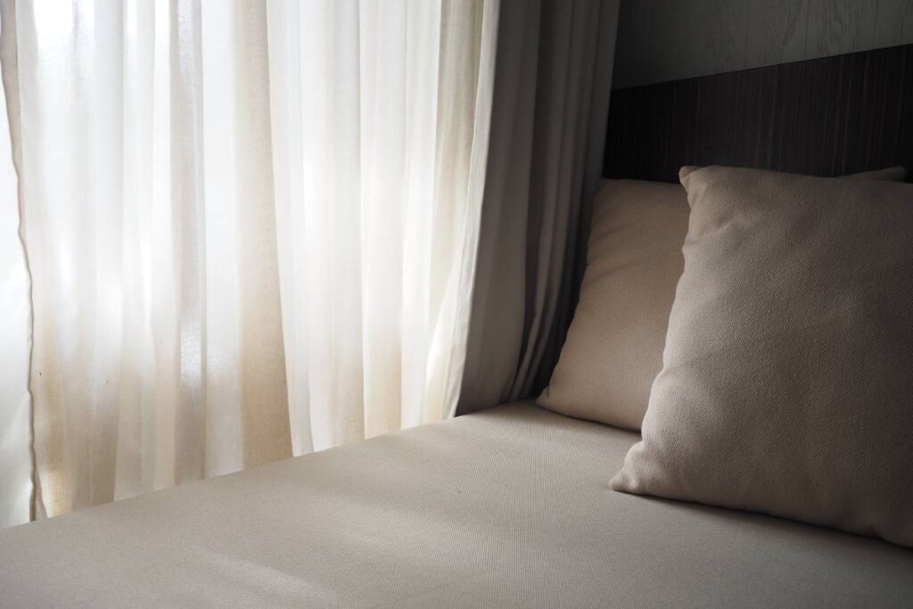
Texture Completes the Palette
Matching tones is only part of the equation. Texture brings it to life. Smooth, reflective fabrics like silk add visual interest against the backdrop of matte wall, while weaves (like woven wood shades) and linens add depth to soft, neutral tones.
Combine the Power of Window Fashions and Paint Tones near NYC
Your walls and windows should speak the same visual language. Whether your style leans modern or classic, the right pairing of color and texture can transform your home into a curated retreat.
Our design consultants specialize in helping New Yorkers craft spaces that feel intentional from floor to ceiling. From neutral paint tones and earth tone paint colors to custom drapery and shades, we’ll help you find the perfect balance between palette, pattern, and personality.
Ready to start your next design story? Schedule a free in-home consultation with our team today and discover how beautiful harmony can look in your own space.
We are locally owned, operated, and proud to serve the New York City area, including Manhattan, SoHo, Chelsea, Long Island City, Gramercy Park, Hell’s Kitchen, Lower East Side, Throgs Neck, The Bronx, Upper East Side, Upper West Side, Uptown West, Yorkville, and surrounding communities.