Learn how Benjamin Moore can play up your palette for a designer look.
When you think about neutral colors, you probably picture soothing whites and off-whites, gray paint colors, and subtle beige tones. Pleasant and unobtrusive pewter or taupe – but not particularly inspiring.
When it comes to interiors, you recognize that neutral paint colors are a solid choice for balancing out bright or boldly-printed rugs, artwork, and furniture. And you know it’s a good idea to choose a neutral palette if you’re planning to sell (or even rent) your home within the next few years: They’re universally appealing and do a great job of showing off architectural features, wood floors, and natural light.
But what if you’re looking to make more of a statement? You want to go bold, but maybe you can’t risk fire engine red or marigold yellow. Can you still create a daring look with neutrals? Today, the answer is a resounding yes.
When you start taking a closer look at neutral color families, you’ll realize that they’re not at all devoid of color. Many neutrals feature-rich and complex undertones: blues, greens, purples, even hints of gold and warm reds. While you may think you’re choosing a totally failsafe color for, say, your dining room, getting the wrong undertone in a neutral paint color can completely throw off the look you were hoping to achieve. Your light gray walls will not work with your red and coral Moroccan rug if that gray has undertones of olive or sage green.
On the other hand, if you pick out a neutral color that complements your other design elements, offering just the right balance of warmth and brightness, your space can be completely transformed – looking like it came straight off the pages of your favorite design magazine.
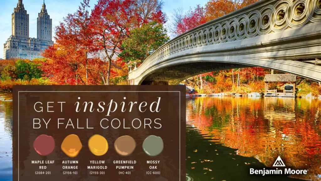
To help you pick out the perfect interior color palette for your home, we put together this quick guide. Learn how to go bold with neutrals like the pros, featuring some of our favorite trending Benjamin Moore colors. And when you’re ready to get started, just stop by one of our New York City stores or place an order online.
What are Neutral Paint Colors?

Neutral colors are difficult to define because they’re perceived subjectively. At what point does a gray stop being gray and start being blue? No two people would have exactly the same answer to this question. So, it’s important to remember that almost every person, designer, or artist you speak with may have a different definition of neutral paint. We think that the only definition that matters is your own!
Traditionally, neutral colors are defined as hues that don’t appear on the color wheel, or that appear to be without color. As a result, they complement most primary and secondary colors (rather than fighting with them). The “basic four” neutrals are white, black, brown, and gray – with beige, tan, and off-white making frequent appearances on the “core neutrals” list.
Some designers classify variants of these colors into two categories: Neutrals and near-neutrals. Near-neutrals are what we tend to focus on the most in the world of interior (and exterior) paint; these have less-subtle undertones that add just enough personality to take the “blah” out of beige. It’s helpful to note that natural wood tones, like your pine or mahogany floors, are also considered neutrals.
How to Style Neutral Paint Colors in Any Room
Making a statement with neutrals is as simple as balancing the overall color palette in your space. That means taking into consideration not only the room itself (looking at your floors, windows, ceiling, etc.) but also the furnishings and decor you plan to use. A neutral paint color makes it a lot easier to change up furniture later on, but you’ll still have to account for undertones and lightness versus depth of the shade.
Looking at a color wheel to identify complementary colors is a good way to start narrowing down your paint choices. Dark blue-violet, for example, is complementary to light orange. If you have a set of richly-hued navy blue accent chairs you want to feature in your living room, try a warm beige paint color with coral undertones, like Benjamin Moore Barbados Sand (1094).
Anytime you’re working with neutrals, make sure you’re balancing warm and cool tones as well as light and dark shades. Even the level of gloss in the paint you choose can have a significant impact on the overall look. For most neutrals, less gloss is better. And be careful when pairing two or more neutrals with very similar undertones: Especially with beiges and yellow-hued off-whites, too much of the same thing can feel oppressive – or just bland.
Another tip? Don’t be afraid of darker shades, especially if you want to create an accent wall. Dark charcoal gray (or even black) adds a layer of edginess and sophistication when juxtaposed against bright white trim, flooring, or furnishings – and it makes any pops of color (in artwork, for example) stand out. And as long as you use enough of a light color elsewhere in the room, or have lots of natural light, it won’t feel closed-in or overbearing.

This living room accent wall creates the perfect backdrop for the vintage rug, mid-century accent chair, and light wood features. The dark gray is Benjamin Moore Day’s End (2133-30) and the adjacent white walls are Benjamin Moore Cotton Balls (OC-122).
Remember that the main benefit of using neutral interior paint colors is to draw wanted attention to other brighter, bolder features in the space. The neutrals themselves are meant to be complementary – not the first thing your eye picks up when you walk in the room. Focus on shading (i.e. very pale gray versus very dark gray) and complimentary undertones, using your existing flooring (warm oak? cool-toned tile?) and amount of natural light as a guide. As long as these elements are balanced, it’s hard to go wrong!
Shop Janovic for the Best Neutral Paint Colors from Benjamin Moore

If you’re redecorating in New York City, trust Janovic for the highest quality paint and supplies. We’re proud to be partnered with Benjamin Moore, one of the most reputable makers of top-of-the-line paint, primer, and stain. Our experienced staff are familiar with all Benjamin Moore product lines and are happy to guide you through the selection process. Neutral colors can be overwhelming — but we’re here to help you find the perfect “greige” (gray + beige) for your entryway and explain the subtle differences between your top three choices.
Our stores are open regular hours, and we’re also offering same-day curbside pickup for online orders. We can’t wait to help you tackle your next painting project: Shop online today.