A New York townhome presents a design challenge you don’t encounter in a single-floor apartment: the rooms connect. From the entryway through the parlor floor and up the staircase, colors that work beautifully in isolation can feel abrupt or disjointed when seen in sequence. A whole-home Benjamin Moore paint color palette solves that problem.

Start with a Throughline Color
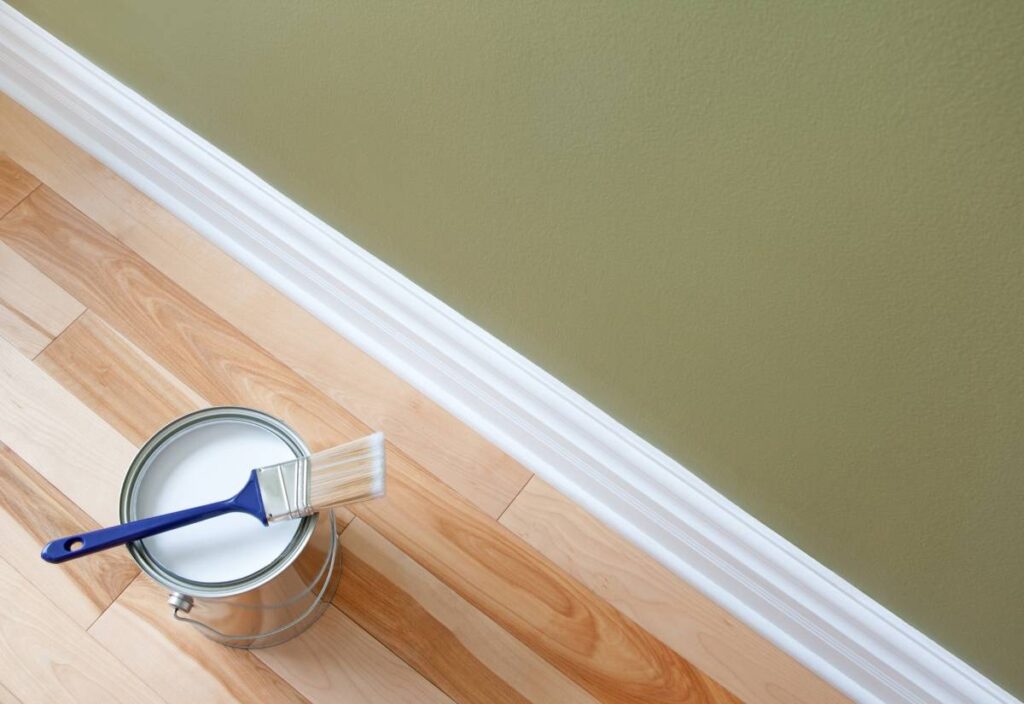
The most reliable approach to a cohesive whole-home palette is to choose one anchor neutral that works across every room—typically for trim, moldings, and ceilings—and let individual room colors operate within that framework. Benjamin Moore White Dove OC-17 interior paint is one of the most consistently successful trim colors in this context. It’s soft enough to complement warm walls without competing, and clean enough to work against cooler tones as well.
With the trim settled, each floor or room can hold its own color while still feeling connected to the whole. That consistency of woodwork is what separates a considered townhome palette from a collection of rooms that happen to be in the same building.
Moving Through the Floors
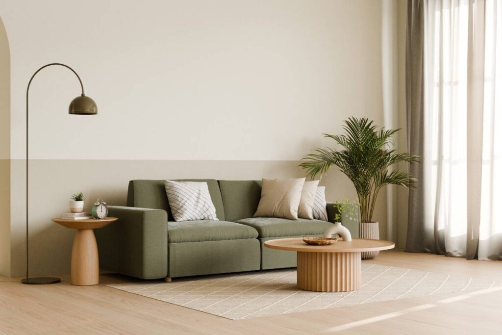
Townhome floors often have a unique charm and character. Color can reinforce that individuality without breaking the visual thread. A warm, grounded neutral like Pale Oak OC-20 on the parlor floor reads as inviting and composed. Moving upstairs, something slightly softer—like Edgecomb Gray HC-173 in a bedroom or office—carries the same warm undertone family while feeling quieter and more restful.
The key is staying within the same undertone family as you move through the space. Mixing warm and cool undertones across adjacent rooms is usually what creates the jarring effect. A designer wouldn’t pair a room with beige-leaning walls against one with lavender-adjacent gray walls—not without a deliberate visual break.
Where Accent Colors Earn Their Place
A deep, grounded color on a library wall or in a powder room, like Benjamin Moore’s Newburyport Blue HC-155, creates a moment that feels curated rather than hasty. These spaces can absorb more intensity because they’re transitional rooms, not places where you linger for long periods.
Stairwells are another opportunity. Because they’re seen from multiple floors, they benefit from a color with enough presence to hold up across distances. A warm mid-tone, rather than something very pale or very dark, tends to perform best as light changes from floor to floor.
Create a Benjamin Moore Paint Color Palette for Your NYC Townhome
Building a cohesive whole-home palette is one of the most satisfying things you can do for your townhome, but it can also feel overwhelming before taking the first step. Our design consultants at Janovic work with these spaces regularly and can help you find colors that carry your home with intention.
Book a Free Shop-At-Home-Appointment to get started, or visit one of our NYC showrooms. We’re locally owned and operated, always happy to serve our neighbors throughout Manhattan, SoHo, Chelsea, Long Island City, Gramercy Park, Hell’s Kitchen, Lower East Side, Throgs Neck, The Bronx, Upper East Side, Upper West Side, Uptown West, and Yorkville.