Our design team wrote a full guide to Scandinavian interior design a few months back, and one line from it keeps coming up in questions since: the palette should let light do most of the visual work. Easy to say. Harder to execute once you’re standing in the paint aisle with forty shades of white staring back at you.
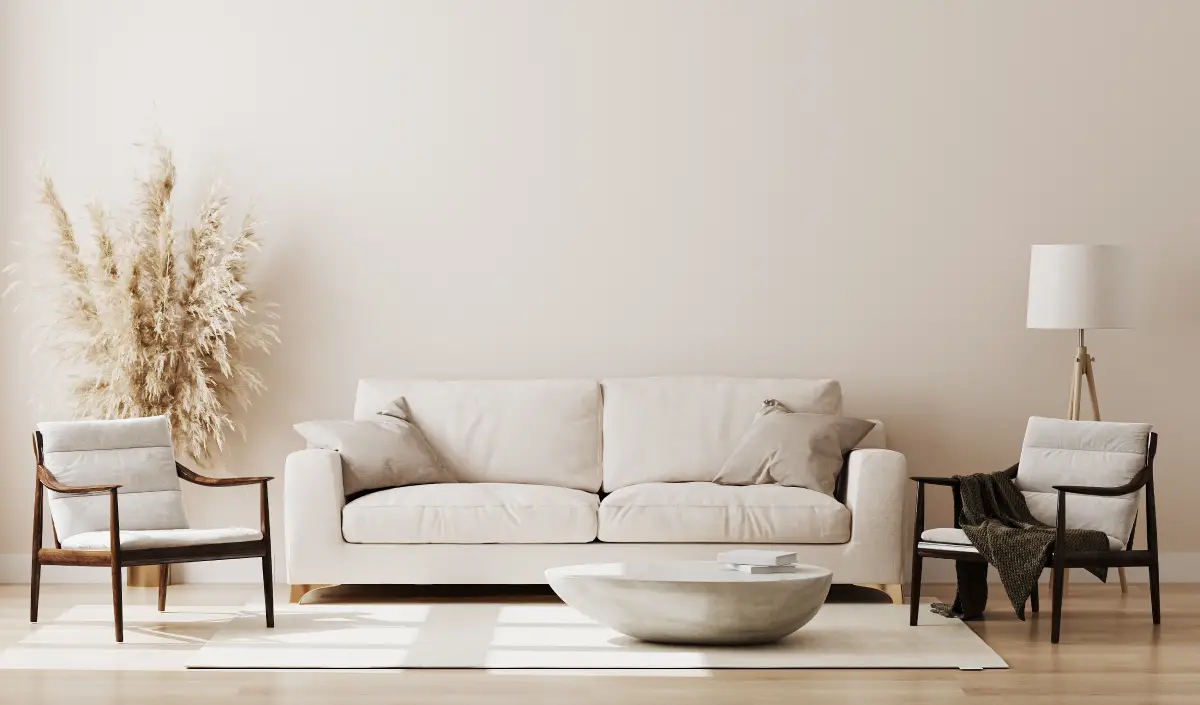
So here’s the color-only version of that guide — how to build a Scandinavian palette wall by wall, instead of picking a nice white and hoping for the best.
Start Warmer Than You Think You Need To
The instinct is to reach for the coolest, whitest white on the deck. That’s the postcard version of Scandinavian design. In practice, a stark white reads clinical fast, especially in a New York apartment that isn’t getting direct sun for eight hours a day. Benjamin Moore Balboa Mist OC-27 splits the difference: white enough to photograph clean, warm enough that the room doesn’t go cold once the sun’s down.
This warm gray also pairs well with other neutral shades, giving you the freedom to layer in a darker tone for the trim, a door, or even cabinetry. We love Benjamin Moore Gray Owl OC-52 for this. It offers just enough depth to give off an almost-green hue in some light, keeping the space feeling fresh without ever reading as bold.
One Color Pulled From Outside
Every Scandinavian room needs a little color borrowed from somewhere natural: moss, driftwood, an overcast sky. Benjamin Moore Beach Glass 1564 does this well in an apartment. This blue-green-gray evokes an overcast coastal day, which feels refreshing yet grounded, and it pairs well with a wide variety of interior décor. It works equally well against wood grain and flat white finishes, which is especially useful in New York apartments, where fixtures can span a variety of decades.
Resist the urge to add a second accent color here. Scandinavian rooms get their calm specifically from not competing with themselves.
Don’t Skip Black
The detail most people miss is a small dose of near-black, which keeps an all-white room reading as serene instead of sterile. Matte black hardware, or a door painted in Benjamin Moore Iron Mountain 2134-30, gives your eye somewhere to land and makes the surrounding white look brighter by contrast. In a studio, one spot is enough — the front door or a hallway usually does the job without asking the rest of the apartment to follow suit.
Let the Windows Treatments Finish the Room
Because we tend to think of Scandinavian interiors as a bit more minimal and free of visual clutter, window treatments play an especially important role in tying the space together in a way that feels complete. This is why we love a low-profile roller shade. If you’re looking for a little more structure, a Roman shade featuring pleats adds subtle horizontal visual interest while filtering light for a soft glow in the mornings and evenings. Each Hunter Douglas collection spans hundreds of fabrics, which makes it easy to play with patterns and enhance the Scandinavian feel of the rest of your space.
Enjoy a Scandinavian Color Palette in Your NYC Apartment
A palette like this reads differently in every apartment, depending on the light and the floors you’re working with. Janovic’s color and design consultants can help you land on the right combination in person, from the first coat of paint to the shade on the window. Book a Free Shop-At-Home Appointment or Color Consultation to get started!
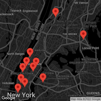
We’re locally owned and operated, proudly serving neighbors throughout Manhattan, SoHo, Chelsea, Long Island City, Gramercy Park, Hell’s Kitchen, Lower East Side, Throgs Neck, The Bronx, Upper East Side, Upper West Side, Uptown West, and Yorkville.
 A Designer's Guide to Elevated English Cottage