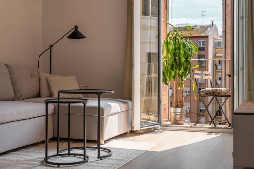
One of the stranger things about painting a prewar apartment or brownstone is that colors from the standard fan deck can look wrong in ways that are hard to articulate. The room is fine, the color looked good in the store, the paint went on cleanly—and yet something’s off. Usually, the issue is the architecture. Plaster walls with actual depth, eight-inch baseboard moldings, windows set into deep reveals, and ceiling medallions: these things change how color reads, and many contemporary paint palettes weren’t developed with them in mind.
What the Benjamin Moore Historical Collection Gets Right
The Benjamin Moore Historical Collection was built around the specific conditions you find in older buildings. Colors like Newburyport Blue HC-155, Van Deusen Blue HC-156, and Hancock Green HC-117 have enough saturation and depth to hold their own against thick plaster walls and heavy painted woodwork. Under the warm, indirect light that comes through north- or east-facing double-hung windows, these colors stay true without going muddy or flat.
The Williamsburg Collection is worth knowing as well. These historical paint colors are based on documented hues from Colonial Williamsburg’s historic buildings—which sounds like a niche provenance, but the warmer ochres, greens, and off-whites in that range translate well to New York’s prewar residential palette. They were made for rooms built to a similar logic: high ceilings, substantial woodwork, and rooms meant to be lived for some time.
What to Do with All That Trim
Prewar apartments and brownstones have a lot of woodwork—door casings, window aprons, baseboards, crown molding—and getting the trim color right matters as much as getting the wall color right. The standard approach is to paint everything a single clean white and let the wall color do its work against that framework. Benjamin Moore White Dove OC-17 has been a reliable choice for this for years: it’s soft enough to sit warmly against deeper wall colors without competing, and clean enough to work alongside cooler tones as well.
Ceilings are worth paying attention to. In a room with a plaster medallion or a deep cornice, painting the ceiling a shade or two lighter than the wall—or in a soft, tinted white that picks up the wall’s undertone—makes the room feel more complete. It’s one of those adjustments that’s almost invisible yet noticeable in how the room feels when you’re in it.
Where to Start, Room by Room
Deep, saturated colors work well in libraries and studies. The light in those rooms tends to be steadier, and the scale of the woodwork gives darker walls something to play off. Newburyport Blue HC-155 has been a go-to for these spaces for years. Branchport Brown HC-72 is worth considering if you want something warmer on plaster walls with painted trim; it shows up much closer to a deep tobacco neutral than anything you’d call brown.
For bedrooms—particularly those facing a courtyard or a narrow side street, which in New York is most of them—something quieter tends to work better. Revere Pewter HC-172 reads warmer than its name and its reputation suggests. Pale Smoke 2116-60 has a muted, dusty quality that works well in rooms that see little direct sun. We highly recommend starting with samples before committing, as these colors shift considerably with different lighting.
Find the Right Color for Your Prewar NYC Apartment at Janovic
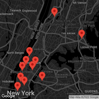
The single most useful thing you can do before committing to a color in a prewar space is to put a large sample on the wall and look at it across a full day’s light. Our team carries the full Benjamin Moore line and can help you narrow things down before you get to that point. Book a free color consultation to get started, or stop by one of our NYC paint stores. We’re locally owned and operated, always happy to serve our neighbors throughout Manhattan, SoHo, Chelsea, Long Island City, Gramercy Park, Hell’s Kitchen, Lower East Side, Throgs Neck, The Bronx, Upper East Side, Upper West Side, Uptown West, and Yorkville.