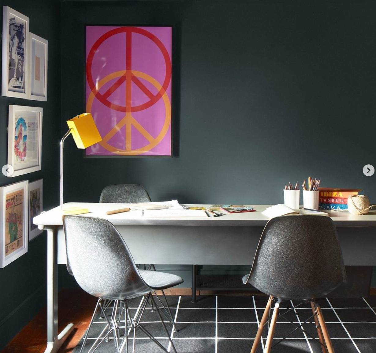
We all know that color brings a room to life, but you need more than one shade to create the most attractive aesthetic. Loving various colors doesn’t mean they look good together, so how do you choose hues that complement one another? Our designers at Janovic share 3 tips for coordinating Benjamin Moore paint colors in your NYC home.

The 60-30-10 Rule
Rules were made to be broken, but even rebellious New Yorkers will recognize the importance of this style guideline. Even the most perfectly coordinated palette of colors will only look its best with the proper proportions. How do you apply the rule to an area of your apartment? Choose a base color for 60% of the space and a secondary complementary shade to cover 30%. Finish the look with an accent color on 10% of the room. The easiest way to begin is by selecting a single color you can’t live without and then adding additional shades that flatter it.
Check Out a Color Wheel
A color wheel is an indispensable tool for color coordination. Complementary colors are found opposite one another on the wheel, while analogous shades are adjacent to one another. One side of the wheel features warm hues, while the adjoining half has cooler shades. You’ll find that working within one half of the color wheel will give your space a harmonious vibe, while choosing colors from both sides of the wheel will invigorate your space.
Remember that lighting has a significant impact on the appearance of paint in a room. Direct sunlight will brighten up a color, while an overcast day will bring soft illumination to the hue. Artificial light warms up any shade.
When sampling colors, leave a swatch in a space for a few days to see how it looks in varying light. You may be surprised to see how greatly shades can vary depending on the light they’re in.
Go With a Monochromatic Look
Do you love green? We mean, do you love it enough to cover an entire room with it?
We say, go for it, but consider a monochromatic look instead of painting your space all in the same shade. Monochromatic color schemes are one of the easiest to create because you only have to decide on a single hue in varying shades. If a monochromatic palette is right for you, use darker colors at the bottom of the room and lighten the shades as you move up. This will draw the eye upward to make your space look larger and more open.
We encourage you to learn about paint sheens if you take a monochromatic approach. Various sheens within a space add contrast and depth, but some are better suited to specific areas in a room than others.
A semi or high-gloss finish is durable but doesn’t cover imperfections well, so precise application is necessary. These sheens are typically reserved for trim and cabinetry. Flat and matte paint conceals flaws but is much less durable, so we suggest using these finishes in low-traffic areas. Eggshell and satin finishes are the classic middle ground of the sheens and look great just about anywhere.
Contact Us to Coordinate Benjamin Moore Paint Colors Near NYC
Find ethereal color combinations for your NYC apartment at Janovic. Visit one of our many locations throughout the city, or book an in-home color consultation. We’re proud to be New York City’s leading Benjamin Moore paint and Hunter Douglas window treatments dealer.


